Eleven Climate Models Agree Antarctic Meltwater Grows Sea Ice Area. They Do Not Agree on How Much

Eleven climate models were handed the same odd instruction: pour fresh water into the ocean all the way around Antarctica, at a steady rate, and do not stop. In every one of them, the area of sea covered by ice grew. That is where the agreement ended.
The experiment, published Oct. 9, 2026, in The Cryosphere, is the first time more than one climate model has been asked that question about sea ice. Andrew G. Pauling, a physicist at the University of Otago in New Zealand, led the analysis; among his co-authors is Neil C. Swart of Environment and Climate Change Canada, who helped set up the project the runs belong to. The aim was not to forecast anything. It was to find out whether climate models agree with one another about a process that none of them currently contains.
The missing process is Antarctica's ice sheet. In the CMIP6 generation of models, the round behind today's climate projections, the ice sheet is held in balance: the fresh water it delivers to the Southern Ocean can only change in step with the snow that falls on the continent. The real ice sheet also loses mass at its edges, where floating ice shelves melt from below and icebergs break away, and it has been losing more of it through the satellite era.
So the experiment put some in by hand. The dose was 0.1 sverdrup, a measure of water flow, which works out here to about 3,154 billion metric tons a year, spread evenly across every patch of ocean touching the Antarctic coast. It is far more than Antarctica is shedding today, and the paper says so in its own methods: roughly 6 to 17 times the continent's current net ice loss, and more than twice the water now melting off the undersides of its ice shelves. The experiment was "designed to produce a robust signal for the purposes of model intercomparison, not to match observations over the historical period," the authors write, and the dose is instead "comparable to the projected meltwater flux in the mid-to-late 21st century."
Two further details fix what the result means. Every run began from its own model's preindustrial control simulation, a world without the industrial era's rising greenhouse gases in it, so no emissions scenario is involved at any point. And every run was 100 years long, with the response measured over the last 30, by which time the upper ocean had largely settled.
The models agree on the sign and nothing else
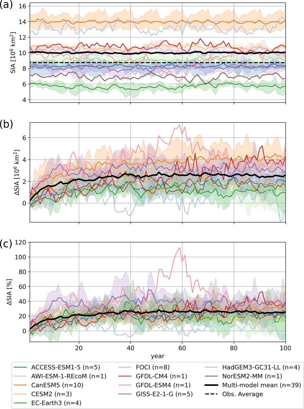
Over that final stretch, annual mean sea ice area rose by between 0.71 and 4.14 million square kilometers, depending on which model was asked. Identical forcing, a spread of almost six times. The weakest responses came from the two models whose Southern Ocean never turns over from top to bottom; the strongest came from those that cooled their sea surface most. The timing differed as much as the size: most models gained ice quickly and then leveled off, while one climbed almost in a straight line for the whole century.
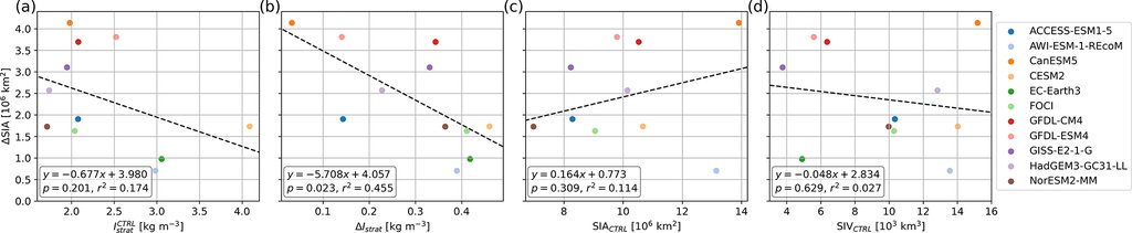
Part of the reason lies in what the models looked like before any water went in: their preindustrial Antarctic sea ice areas differ by more than a factor of two from one model to the next. Pauling and colleagues report that the one relationship to come out statistically significant was between how strongly a model's upper ocean became layered and how much ice it grew; the starting sea ice area and volume explain some of the spread without clearing that bar. The paper's conclusion is about those built-in differences rather than about any central estimate, and no average increase is offered.
Fresher water on top means less heat from below
The mechanism is not this paper's discovery, and the authors present it as the standing explanation from earlier work. Fresh water is lighter than salty water, so meltwater spreading out at the surface leaves the ocean more layered and harder to mix. That slows the delivery of relatively warm water from below up to the surface, where it would otherwise keep ice from forming. In several models the added fresh water also shut off the patches of open sea, far from the coast, where the whole water column turns over and brings heat up from the depths.
The experiment simplifies on purpose, and the paper lists how. The water enters evenly all the way around the continent, while the real losses are concentrated in the Amundsen and Bellingshausen seas. It all enters at the surface, while most of the melt from Antarctica's thinning ice shelves enters at depth. And the heat it takes to melt ice is never taken out of the ocean, so the runs carry the freshening without the chilling that goes with it.
The real Antarctic is going the other way
None of this means the ice around Antarctica is growing. It is not. The paper's own introduction records that Antarctic sea ice area crept up through the satellite era to a record high in 2014 and then fell sharply, and it has stayed at or near record lows since 2016, with the lowest summer minimum in the record reached in February 2023. Climate models have largely failed to reproduce that decline, which is one reason the missing meltwater is of interest at all. What these runs add is fresh water to a preindustrial world, with none of the warming that is doing the melting.
The direction of the effect, at least, is not an artifact of the oversized dose. A separate 2023 study in Geophysical Research Letters, by Tessa Gorte and colleagues at the University of Colorado Boulder, fed one model a realistic amount of Antarctic meltwater, taken from observations for the past and from an ice sheet model for the future. It kept 83% more sea ice than the same projection run without the meltwater. Different group, different model, realistic dose, same sign.
What the eleven-model spread hands the modeling groups is a measurement of their own uncertainty. Earlier single-model studies had disagreed flatly over whether meltwater could reverse a modeled sea ice decline, some finding a modest flux enough and others finding a far larger one insufficient, and settling that was the reason the Southern Ocean Freshwater Input from Antarctica initiative was set up. It has since been endorsed as an intercomparison project for CMIP7, the next coordinated round of model runs, and it has been proposed that Antarctic meltwater become a standard ingredient of those runs. Its next set of experiments trades the idealized dose for historical estimates and for projections under real emissions scenarios. Those will be the runs that can be compared with the Antarctic anyone can see.