Beyond the 100-Year Flood Line: A Probability Map for Puget Sound's Rising Water

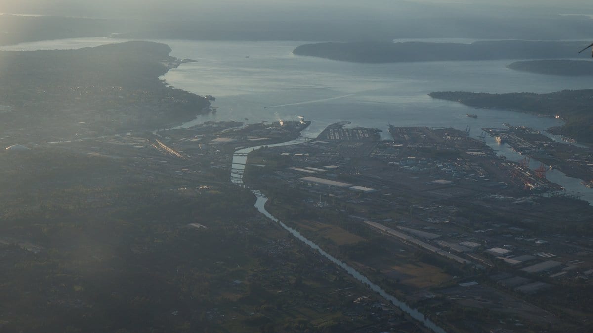
Almost everyone who has bought a house near water has met the 100-year flood line. It shows up on insurance forms and zoning maps, a single crisp boundary that seems to promise certainty: inside, you flood; outside, you are fine. The trouble is that the line was never meant to carry that much weight. It describes one hypothetical event with a one-percent chance in any given year, and it says nothing about the many other ways water actually arrives.
Along the shores of Puget Sound, water rarely arrives one way at a time. A king tide can coincide with a Pacific storm surge while swollen rivers push toward the sea from inland. Any one of those might be survivable; together they compound. That interaction is exactly what a single design-event line cannot represent, and it is the problem a team from the U.S. Geological Survey, Deltares USA and the Washington State Department of Ecology set out to solve for two of the state's most populous counties.
Decades of weather, not one worst case
Instead of picking a single hypothetical storm, the researchers ran the real thing, or as close to it as a model allows. Their study in Natural Hazards and Earth System Sciences, published on 13 July 2026 by Kees Nederhoff, Kai Parker and Eric Grossman, fed more than 80 years of continuous coastal and river conditions through a fast flood model called SFINCS, letting tides, surge and river flow interact the way they do in the world rather than in a design table.
From that long run they could count, cell by cell across the map, how often each patch of ground actually went underwater. That yields something a single line never can: the Expected Annual Flooded Area (EAFA), a probability-weighted measure of how much land floods in an average year, blending frequent small events with rare catastrophic ones. Under present conditions, that came to roughly 56 to 200 hectares across King County and 250 to 644 hectares across Pierce County, depending on how severe a flood is counted.
The model was not asked to be believed on faith. Against tide-gauge records it reproduced coastal water levels to within 14–17 centimetres, and its flood footprints agreed with existing FEMA maps 75 to 83 percent of the time. That is close enough to trust the map and different enough to make it worth drawing.
Sea level, not storms
The study's sharpest finding concerns the future, and it cuts against a common intuition. Ask people what will drive worse flooding and many will say bigger, wetter storms. Here, storm and rainfall changes on their own barely moved the numbers through 2050. What moved them was the sea itself.
Sea-level rise dominated the projected increase in flood hazard. With a metre of rise, flooded area grew by somewhere between 80 and 360 percent, depending on location. Climate-driven changes to storms alone produced only minimal change. And the growth was not smooth. The model showed a substantial jump once sea levels climb past roughly 100 to 150 centimetres, about one to one-and-a-half metres. Beyond that threshold, low-lying ground that had stayed dry starts to go under in bulk. Risk, in other words, does not rise in a gentle line. It has a cliff.
Half a metre the old maps miss
There is a quieter, practical warning folded into the results. When the team compared their compound, probabilistic approach with the kind of simpler deterministic map that many agencies still rely on, the older method could underrepresent flood hazard by about half a metre, because it left out contributing factors that, on the ground, do not politely take turns. In a flat coastal floodplain, half a metre of unaccounted-for water is the difference between a wet lawn and a flooded ground floor.
None of this pinpoints which street floods on which night; that is not what a hazard map is for. What it offers planners is a more honest ledger: not a single line dividing safe from unsafe, but a spatially detailed sense of how the odds stack across a landscape, and how they steepen as the sea rises.
The evidence is peer-reviewed: this is the final published version of work that first appeared as a 2025 preprint, now vetted and issued in NHESS. As a template, the approach travels: any low-lying coast where tides, surge and rivers meet could be mapped the same way. The line on the old map was always a simplification. This study is an argument that, as the water rises, we can no longer afford to mistake it for the truth.
Sources
- Natural Hazards and Earth System SciencesPeer-reviewed