Draw the City Boundary Differently and the Carbon Math Changes

"Cities cause most of the world's carbon emissions" is one of those facts that sounds precise until you try to pin it down. Most? Two-thirds? Three-quarters? The honest answer is that it depends on a decision made before any counting starts: where does a city end? Stop at the dense core and you get one number. Include the sprawl of suburbs, ports and industrial fringe that a city depends on and you get a much larger one. Change the boundary, and the carbon math changes with it.
A new study tries to make that choice consistent everywhere at once. Published on 2 July in Environmental Research Letters by Ying Yu of the Chinese University of Hong Kong–Shenzhen with Diego Manya and Angel Hsu of the University of North Carolina, it builds a globally uniform framework that divides the world into urban centres, peri-urban zones and rural areas, and pins each to real administrative boundaries. That last part is the point. By aligning emissions with the governance units that actually make decisions, cities, counties, provinces, the authors produce figures that can be compared across countries and, just as importantly, handed to the bodies with the power to act on them.
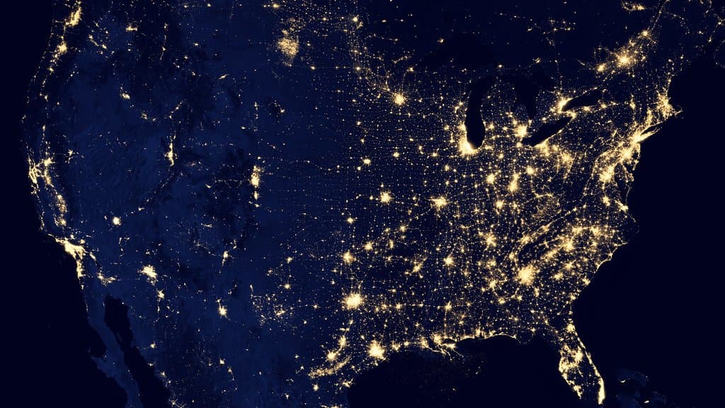
Run the accounting that way, and urban areas produced 72-76% of the world's territorial CO2 emissions in 2022, the study finds, splitting the total between dense urban centres (30-37%) and the sprawling peri-urban ring (39-42%). That peri-urban share is the quiet surprise: the outskirts, not the downtown skyline, carry the larger load. A city's carbon, in other words, lives well beyond the postcard skyline, and where you draw the edge changes the number.
The number shifts again when you ask a different question. Territorial accounting tallies emissions where fuel is physically burned. Consumption-based accounting instead assigns them to wherever the goods and energy are ultimately used, following the carbon embodied in traded steel, cement, electronics and food. On that basis, the study puts the urban share at roughly 82% for 2015, higher than the territorial figure, because cities consume more than they produce inside their own limits. Sixty-three percent of regions, the authors report, are net importers of embodied emissions: their consumption outruns what they emit at home, with the difference made up somewhere else's factories and power plants.
None of these percentages is a single hard truth to be memorised. They are outputs of defensible but different choices, and the study's contribution is less any one headline figure than making those choices explicit and consistent, so a city in Ohio and a city in Guangdong are measured the same way. The paper is an accepted manuscript, in press at the journal and not yet in its final typeset form, so the exact figures may be refined. Its own numbers are given as ranges, and they sit comfortably inside the roughly 67-80% span that other estimates of the urban carbon share have produced.
The practical value is in what the ranges enable rather than in rounding them off. If most of the world's emissions really are urban, and if the largest slice sits in the peri-urban fringe and much of it is imported through trade, then climate policy aimed only at glossy city centres is aiming at the wrong target. A consistent map, drawn to the same rules everywhere and matched to the authorities who can use it, is a modest-sounding tool with an outsized job: telling cities not just how much carbon is theirs, but which carbon they can actually do something about.
Sources
- Environmental Research LettersPeer-reviewed